Bright
 Dark
Dark Floral Print
 Multicolored
 White
White Pink
Pink Beige
Beige Red
Red Blue
Blue Green
Green Purple
 Black
Black Gold
Gold Silver
 Neutral
What Color Dress Is Best for Engagement Photos? A Complete Guide
There’s a question we get asked almost every week — sometimes twice in a day. “What colour should I wear?” It sounds simple. It isn’t. The right colour depends on your skin tone, your shoot location, your photographer’s editing style and honestly, what feeling you want the photos to carry. A blush gown at golden hour against a field reads completely differently than the same dress in a forest at noon. So before you land on a colour, it’s worth thinking through a few things first — and that’s exactly what this guide is for.
We’ve dressed hundreds of couples for engagement shoots across the GTA and across Canada and the US. Here’s the honest version of that conversation.
Why Dress Colour Matters More Than You Think
Most people treat colour as a style decision. It is — but it’s also a technical one. The colour of your gown affects how the camera reads the image, how your skin tone renders and how much work your photographer needs to do in post-production. A dress that looks stunning in person can wash out completely in bright midday light or disappear into a dark forest background if the tone isn’t right.
Your photographer is working with light, shadow and contrast all at once — the dress colour is a variable in that equation, not just a preference. The good news is that once you understand a few basic principles, the choice becomes much clearer. And if you’re ever genuinely unsure, that’s exactly what the dress fitting appointment is for — we’ll tell you directly what we think works for your colouring and your shoot plan.
All 200+ gowns in our catalogue are organised by colour, which makes it easier to compare options before you come in or before you submit a rental request. The categories cover everything from bright whites and soft neutrals to deep jewel tones, floral prints and metallics. Below is a breakdown of how each major palette actually performs in front of the camera.
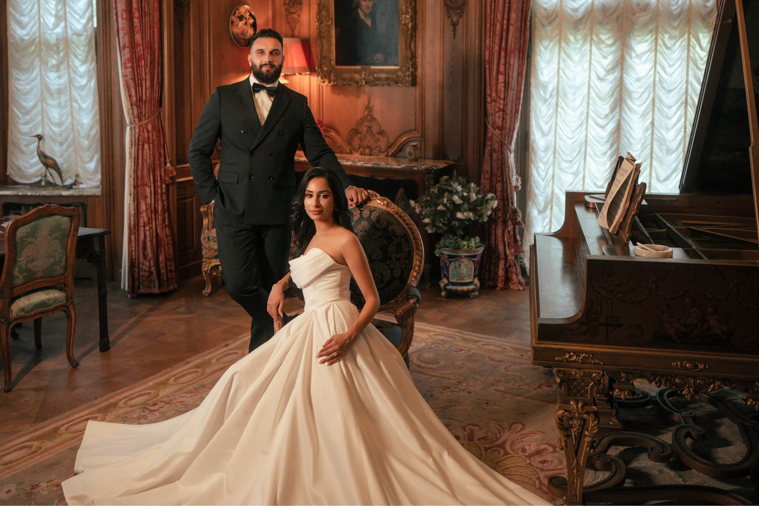
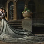
White and Ivory – The Classic Choice
White photographs beautifully — when the light is right. In soft, golden or overcast light, a white or ivory gown creates a luminous, romantic quality that’s hard to replicate with any other colour. It reads as clean, elegant and timeless. The challenge is that white can blow out in harsh midday sun — meaning the detail in the fabric disappears and the dress becomes a flat bright shape in the frame. If your shoot is in midday light or somewhere with a lot of direct sun, ivory is a safer choice than pure white because it holds its tonal depth better.
For skin tone, white and ivory work across a wide range — but warm ivory tends to be more universally flattering than stark white, which can cast a slightly cool tone against warmer complexions.
Blush and Soft Pink – The Most Popular Choice for a Reason
Blush is consistently one of the top-requested colours in our catalogue and there’s a clear reason for it. It photographs warmly, pairs beautifully with almost every natural backdrop and reads as romantic without being overly bridal. Against green foliage, blossoms or golden fields, a blush dress creates a natural harmony that feels effortless rather than coordinated.
It also tends to be flattering across a wide range of skin tones — particularly in satin, which catches light in a way that adds dimension to the fabric. The risk with blush is that it can veer into “too sweet” territory if the setting is already very soft and feminine. If that’s a concern, balance it with a bolder bouquet, darker accessories or a shoot environment with more contrast.
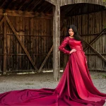
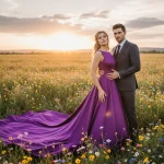
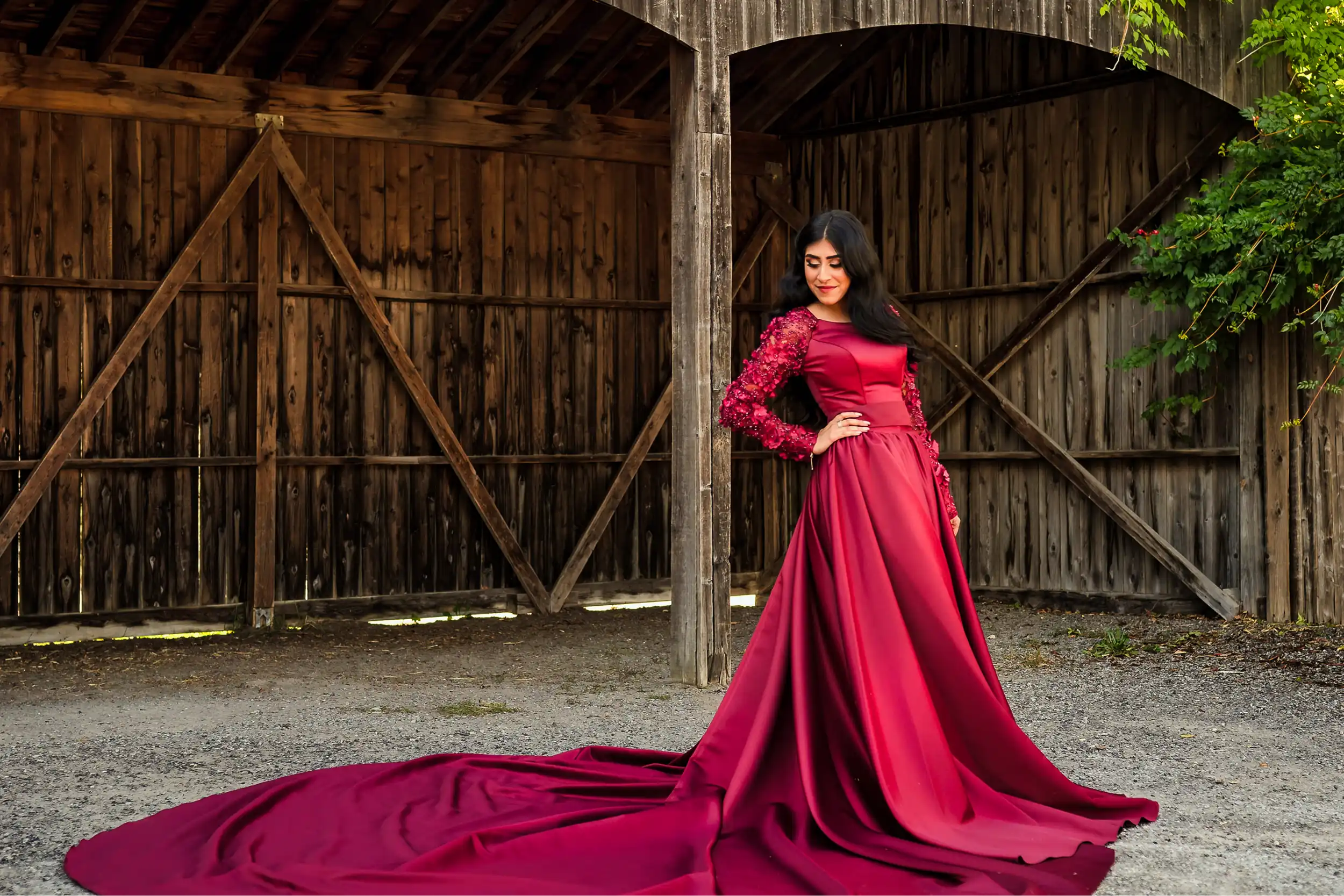
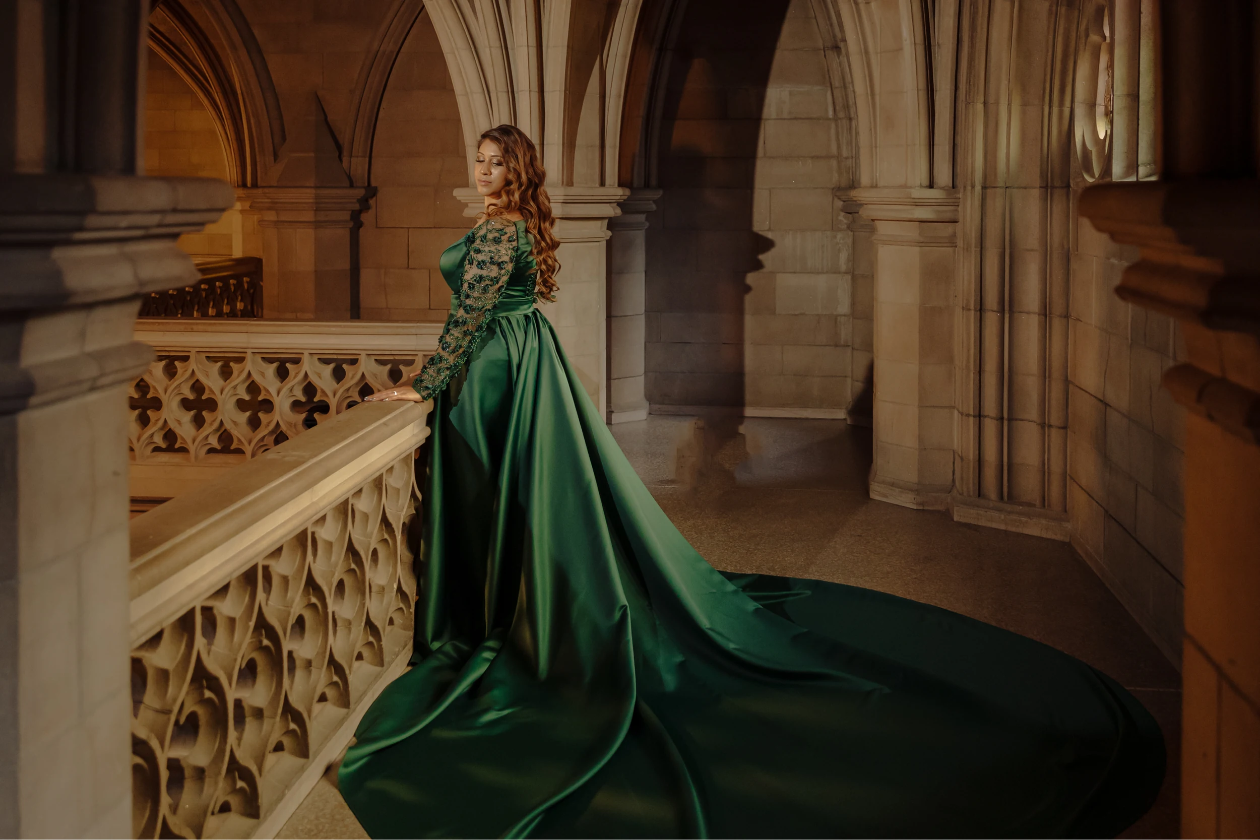
Deep Jewel Tones – Bold, Cinematic and Surprisingly Versatile
Navy, deep burgundy, forest green, cobalt, rich plum. These colours photograph with a depth and richness that lighter palettes simply can’t match. They hold fabric detail extremely well — you see every fold and movement of a train in a dark jewel tone in a way that sometimes gets lost in softer colours. Against a bright spring backdrop or a neutral urban environment, the contrast is striking.
Deep tones work especially well for couples who want a more dramatic, editorial quality to their images — less fairytale, more film still. They’re also a strong choice for South Asian engagement shoots where the aesthetic often leans vibrant and rich rather than soft and muted. One thing to keep in mind: dark gowns absorb light rather than reflect it. In low-light conditions the dress can go flat. The solution is timing — shoot in the hour before golden hour when the light is warm and directional, not overhead.
Earthy Neutrals – Timeless and Underrated
Warm beige, terracotta, warm white, dusty rose, soft rust. This palette has been growing steadily and in 2026 it still reads as timeless rather than trend-driven. Earthy neutrals photograph particularly well in warm afternoon light and work beautifully in natural settings — fields, forests, lakesides. They also carry a warmth that flatters a wide range of skin tones, particularly medium to deeper complexions where cool whites can feel slightly stark.
If you’re planning a golden-hour shoot outdoors, this palette is genuinely hard to get wrong. The warm tones of the dress and the warm tones of late afternoon light work together in a way that needs almost no correction in editing.
Metallics – High Risk, High Reward
Gold, silver, champagne with metallic thread. These photograph spectacularly — when the conditions are right. A metallic gown in direct low-angle sunlight does things that no other fabric can. The reflections, the movement of light across the fabric as the gown moves — it’s genuinely cinematic. The risk is that in flat or overcast light, metallics can look costume-y rather than elegant. They need the right environment to perform.
If you’re drawn to metallics, talk to your photographer first. Make sure they’ve shot metallic fabrics before and have a lighting plan. In the right hands and the right setting, it’s one of the most breathtaking choices you can make.
How to Match Colour to Your Skin Tone
Colour theory applied to real fabric under real light is different from a colour wheel on a screen — and that’s exactly why the fitting appointment exists. That said, a few general principles hold up consistently:
- Fair or light skin tones → soft neutrals, blush, ivory and dusty rose tend to be the most flattering. Very stark white can wash out fairer complexions in bright light.
- Medium or olive skin tones → enormous range. Jewel tones, deep warm colours and earthy neutrals all photograph beautifully. Blush and ivory work well too.
- Deeper skin tones → deep jewel tones are particularly striking — the contrast between the richness of the fabric and the depth of the skin creates genuinely dramatic images. Bright whites and warm golds also photograph beautifully.
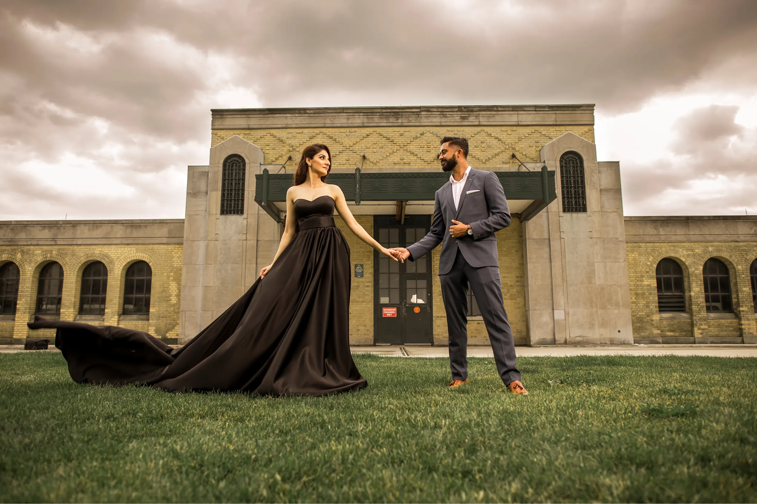
What About Your Partner’s Outfit?
A colour choice doesn’t exist in isolation — it exists next to another person. The general principle is complement rather than match. Perfectly coordinated outfits in the same tone usually read as costume rather than couple. A soft contrast — your blush gown against their charcoal or navy — creates visual balance without looking stiff. Earth tones are particularly easy to pair: almost any neutral reads well next to a warm beige or terracotta gown.
Browse by Colour Before You Decide
Our catalogue is organised by colour for exactly this reason — so you can look at all the blush options together, or compare ivory to champagne side by side, before you come in or before you submit your request online. Take some time with it. Screenshot what you like. Bring references to your fitting or include them in your rental request note.
And if you want an honest opinion on what will actually photograph best for your specific shoot — just ask. That’s what we’re here for.
About the designer
Helen Illumina is the self-taught designer behind Athena Dress Rental, creating couture gowns in Canada using premium fabrics sourced worldwide.
about us