 BACK
BACK Bright
 Dark
Dark Floral Print
 Multicolored
 White
White Pink
Pink Beige
Beige Red
Red Blue
Blue Green
Green Purple
 Black
Black Gold
Gold Silver
 Neutral
 BROWSE ALL DRESSES
How to Choose a Dress Color for Your Engagement Photos – Based on Shoot Location
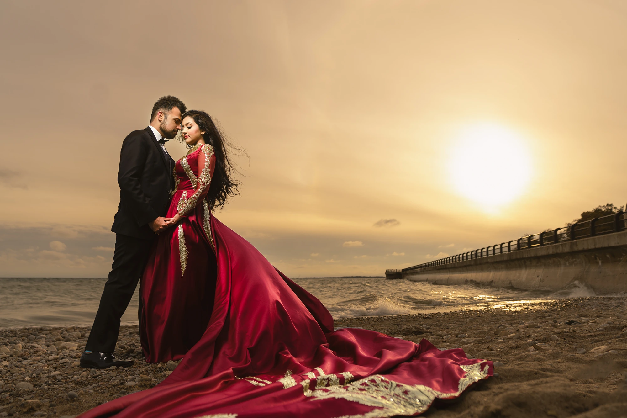
Most people choose a dress colour based on what they like. That’s a reasonable starting point – but it’s only half the equation. The other half is the location. A colour that photographs beautifully in one setting can completely fall apart in another, and it’s rarely obvious until you see the photos back. Blush in a tulip field is one thing. Blush against beige sandstone is another. The dress and the location need to work together – not just look nice separately – and the earlier you think about them as a pair, the better your photos will be.
We’ve helped couples navigate this exact decision across every kind of shoot setting – urban streets, open fields, forested trails, beaches, lakesides and everything in between. Here’s how to think about colour based on where you’re actually shooting.
Why Location Changes Everything About Colour
Colour in photography isn’t just about what looks good on you – it’s about what the camera sees when it puts your dress against the background. Contrast matters: a dress that matches the environment blends into it, and a dress that contrasts too sharply can feel visually disconnected from the setting. The ideal is a colour that relates to the environment without disappearing into it – something that holds its own in the frame while still feeling like it belongs there.
Light is the other factor. Warm late-afternoon light does different things to a white gown than cool midday light does, and a dark jewel tone in a shadowed forest reads completely differently than the same dress in open sunlight. Your photographer can work with whatever you choose, but giving them a colour that works naturally with your location means less they have to compensate for in editing – and usually stronger images as a result. This is why the dress-colour conversation and the location conversation need to happen together, not in separate decisions.
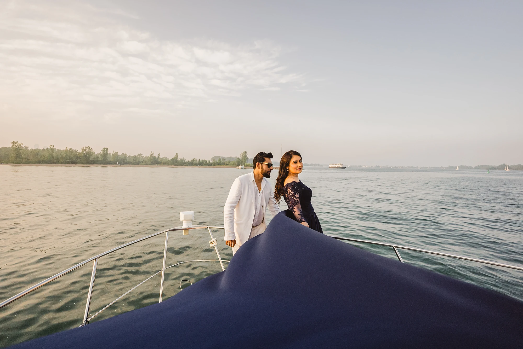
Colour by Location – What Actually Works
The challenge with colour advice is that most of it gets written without a specific location in mind – and that makes it almost useless in practice. “Blush is universally flattering” is true in a general sense but tells you nothing about whether blush will photograph well against the sandstone walls of a historic building or the grey concrete of a downtown street. Location-specific colour thinking is more useful and more honest. Each environment has a dominant palette, a light quality and a contrast logic – and the dress colour that works best is the one that accounts for all three. Below is a breakdown of the most common shoot settings and what actually works in each one.
Natural Green Settings – Parks, Forests, Fields
Green backdrops are the most common engagement shoot environment and they’re also the most colour-forgiving – almost any palette works here, but some work better than others. Blush, ivory, champagne and soft white read beautifully against green because they’re light against dark – the dress lifts out of the background naturally. Deep jewel dress tones – navy, burgundy, deep plum – create a rich editorial contrast that photographs with real depth. Earthy neutrals like warm beige and terracotta sit harmoniously with green settings without fighting them. What to avoid: sage, olive and any dress tone that’s close to the colour of the foliage itself. These tend to blend the dress into the background, which flattens the image and makes the silhouette harder to read – especially in wide shots where the train needs to be visible.
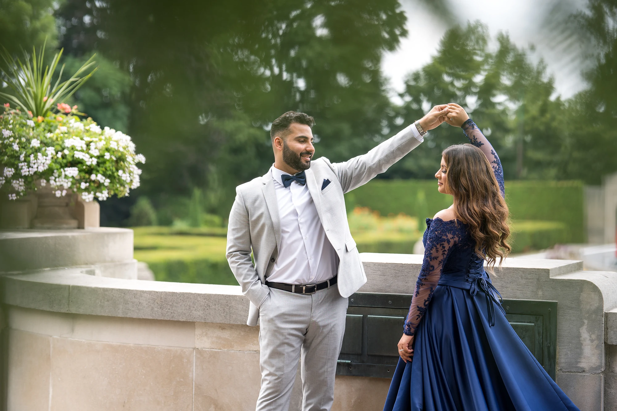
Urban Settings – Streets, Brick, Concrete, Architecture
Urban backdrops are high-contrast environments by nature: lots of texture, varied tones and often a mix of warm and cool surfaces in the same frame. The dress colour needs to be decisive here – something that asserts itself against the visual noise of the environment. Bold colours work best. Deep jewel tones – cobalt, burgundy, forest green, rich plum – are particularly strong against brick and concrete because they hold their saturation in urban light.
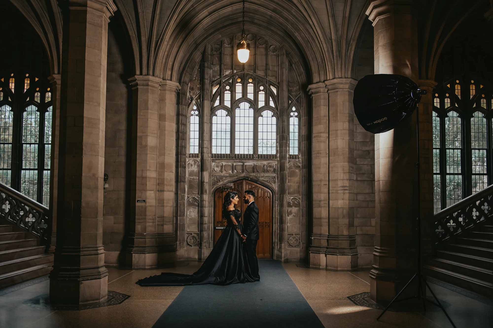
White and ivory also work well against dark architectural backgrounds; the contrast is clean and graphic. Soft pastels and very pale neutrals tend to get lost in urban settings – the environment is busier than a natural backdrop and softer colours can end up looking washed out rather than elegant. Metallics are worth considering here too – artificial light and the reflective surfaces of city environments interact with metallic fabric in ways that natural settings don’t always replicate.
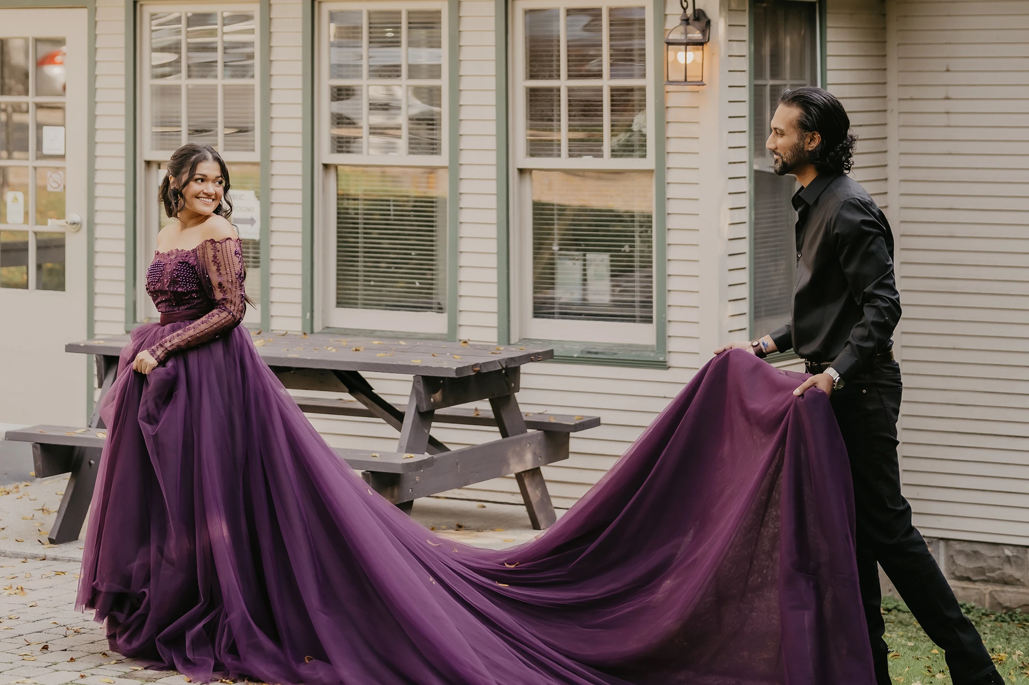
Beaches and Coastlines
Beach settings have a specific colour logic driven by the palette of the environment itself: sand, water, sky and the quality of coastal light, which tends to be bright and slightly hazy. Warm whites and ivory dresses are classics for a reason on beaches – they mirror the brightness of the environment without competing with it. Warm neutrals and earthy tones like terracotta, warm beige and dusty rose complement the sand palette and feel grounded rather than costume-y. Soft blues and ocean-adjacent tones create a cohesive, monochromatic feel against water and sky that looks intentional rather than matched. What to avoid: very dark colours, which absorb the bright coastal light and can look flat or heavy against such an open, luminous backdrop – unless you’re shooting at golden hour or dusk, when dark tones suddenly become dramatic rather than flat.
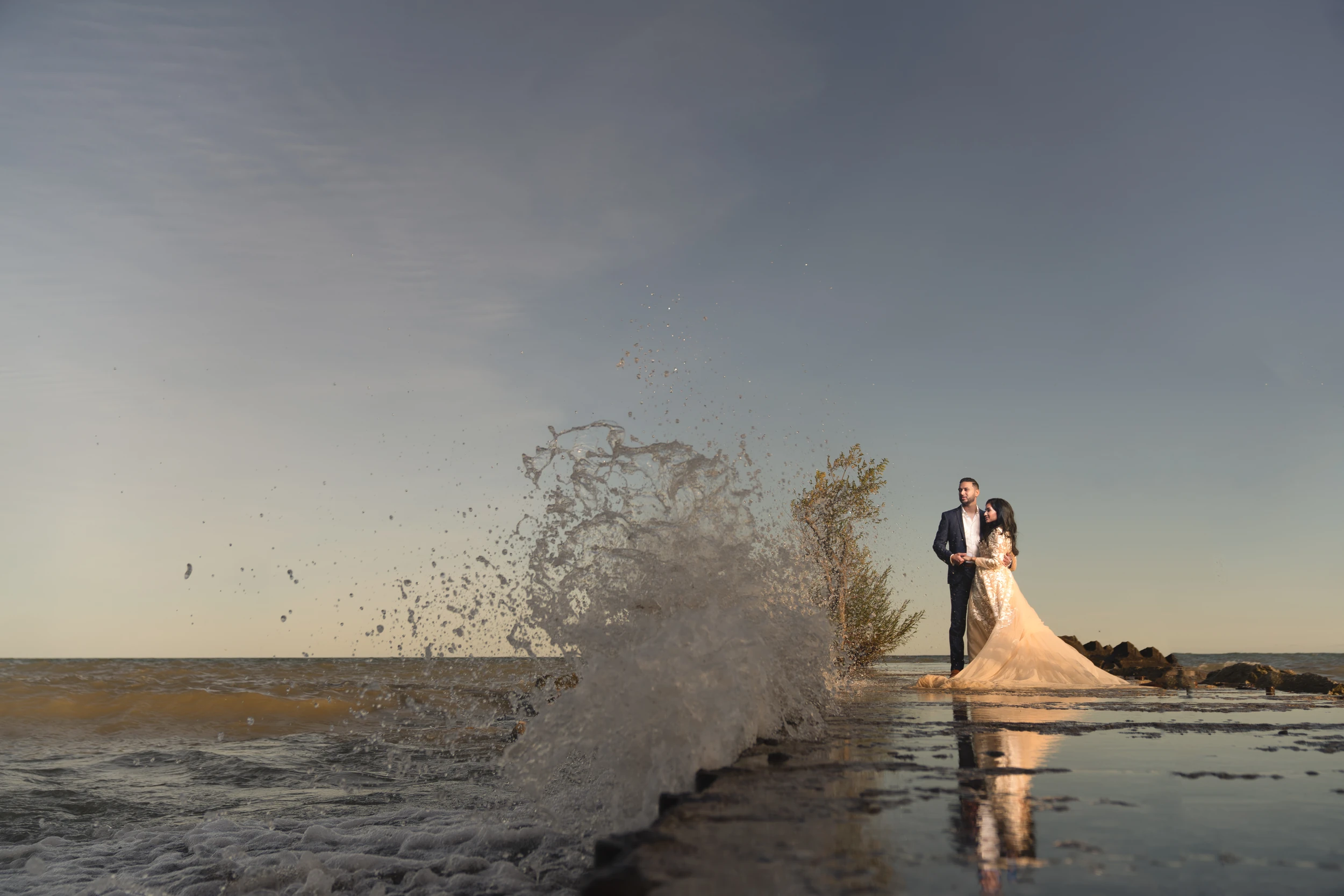
Indoor Settings – Studios, Historic Interiors, Event Spaces
Indoor environments vary enormously, which makes blanket colour advice less reliable than in any other category. The general principle is to look at the dominant tones of the space and choose a dress that contrasts with them rather than blending in. White or neutral studio backdrops are extremely versatile – any colour works and the choice comes down to the mood you want. Warm-toned interiors with wood, exposed brick or vintage furniture pair best with earthy tones and jewel colours. Pale blush and ivory can read as washed-out in very warm-lit spaces. Cool, minimalist interiors reward bold saturated colours – the simplicity of the background lets the dress be the entire visual statement.
One Rule That Applies Everywhere
Wherever you’re shooting, there’s one principle that consistently holds across every environment and every colour palette. Avoid choosing a dress colour that’s the same tone as your partner’s outfit. The visual goal is complement, not match – a slight contrast between the two creates depth in couple shots and prevents the paired outfits from reading as a costume rather than a couple. It’s a small decision that makes a noticeable difference in almost every frame. Your photographer will usually have thoughts on this too – it’s worth asking them when you’re finalising the shoot plan.
Not Sure What Works for Your Location?
Bring your shoot location to the fitting – even just a photo of the space or a reference image from another session shot there. We’ll pull dress options that make sense for the environment and talk through what’s likely to photograph best given the light and backdrop you’re working with. For clients renting dress online across Canada and the US, include your location details in the rental request and we’ll factor it into the recommendation. Browse the full catalogue by colour and start building a shortlist – it’s the easiest way to see what’s available before you come in or reach out.
About the designer
Helen Illumina is the self-taught designer behind Athena Dress Rental, creating couture gowns in Canada using premium fabrics sourced worldwide.
about us